How to Mix Yellow and Green: Step-by-Step Guide to Yellow-Green, Lime, Chartreuse, and Olive Shades
Mixing colors can be both an art and a science, and when it comes to yellow and green, understanding what yellow and green make opens up a world of vibrant and versatile possibilities. Whether you’re a painter, digital designer, or DIY enthusiast, knowing how yellow and green make different shades allows you to create a wide range of colors, from soft yellow-green to bright lime, balanced chartreuse, and earthy olive tones. This step-by-step guide covers everything you need to know to master how yellow and green make perfect mixes.
The question “what color does yellow and green make” might seem simple at first, but the answer is more nuanced than you think. When you mix yellow and green, the result is generally yellow-green, a tertiary color that sits between the two on the color wheel. However, the exact shade depends on the proportion of each color, the medium you are using, and the type of yellow and green chosen.
More yellow produces a warmer, citrus-like yellow-green.
More green results in cooler shades such as mint or olive green.
Equal parts typically yield a balanced chartreuse color.
This flexibility is why yellow and green are so widely used in painting, interior design, and digital media.
Yellow and Green Mix in Traditional Paint (RYB Model)
In traditional RYB paint mixing (Red, Yellow, Blue), yellow is a primary color, while green is a secondary color made from blue and yellow. Mixing them produces a tertiary color called yellow-green.
Yellow Shade
Green Shade
Resulting Color
Visual Description
Lemon Yellow
Emerald Green
Bright Yellow-Green
Vibrant, electric lime
Cadmium Yellow
Sap Green
Olive Green
Earthy, muted
Primary Yellow
Phthalo Green
Acid Green
Bold, high contrast
Warm Yellow
Cool Green
Chartreuse
Balanced, almost neon
Pale Yellow
Light Green
Citrus Green
Soft, spring-like tint
Tips for Paint Mixing:
Start with yellow and slowly add green to reach your desired hue.
Test on a palette or scrap paper before applying to your artwork.
Use palette knives for even mixing, especially with acrylic or gouache paints.
How to Adjust Warm and Cool Shades
Yellow and green are analogous colors, meaning they sit next to each other on the color wheel and blend harmoniously. But the tone can shift based on your mix:
Warm Yellow-Green: Use more yellow. Ideal for sunlight highlights, floral painting, and cheerful interiors.
Cool Yellow-Green: Use more green. Perfect for foliage shadows, minty tones, or natural landscapes.
The warm-cool balance affects mood and visual perception, so artists and designers choose their mix according to the atmosphere they want to convey.
Yellow and Green in Digital Design (RGB & CMYK)
When mixing colors digitally, yellow and green behave differently than in paint because screens use light (RGB model), while printing uses ink (CMYK model).
RGB Mixing (Digital Screens):
Yellow: (255, 255, 0)
Green: (0, 128, 0)
Mixed RGB: (128, 192, 0) → Yellow-Green (#9ACD32)
Other digital variations include:
Lime Green: #32CD32
Light Chartreuse: #98E619
Bright Lime: #CCFF00
CMYK Mixing (Print): Mixing yellow and green inks gives similar yellow-green results, but shades appear slightly duller due to the subtractive nature of printing. Digital color mixing ensures consistent branding, web design, and illustration shades, making it essential for designers to know exact hex codes.
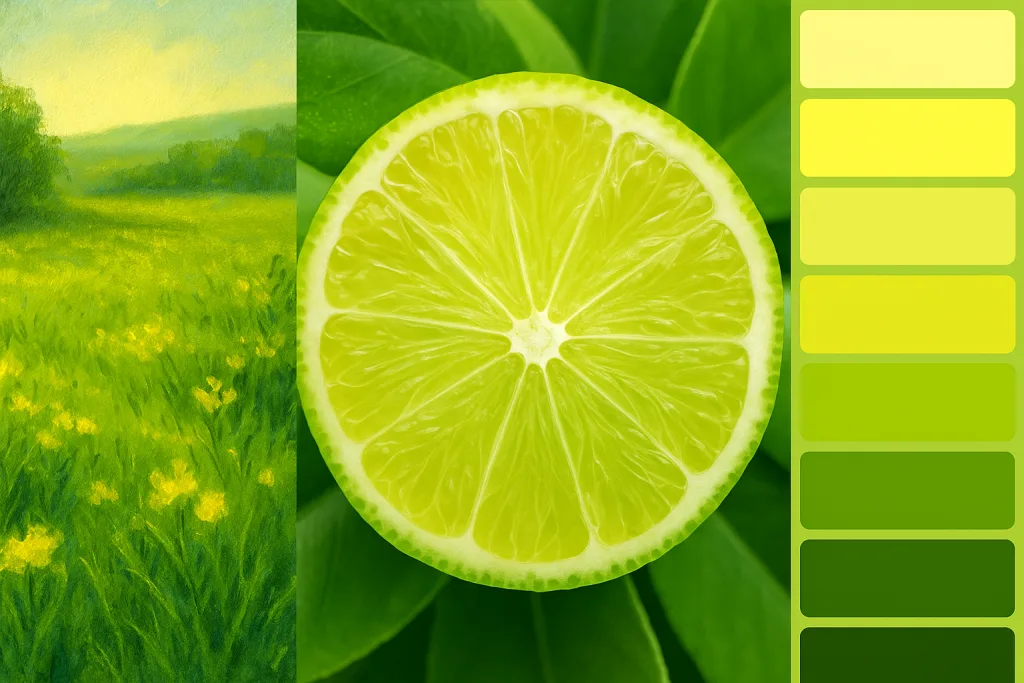
Chartreuse, Lime, and Yellow-Green Differences
Yellow-Green: Broad category; can be warm or cool depending on ratios.
Chartreuse: Balanced between yellow and green, bright yet not too neon (#7FFF00).
Lime Green: Cooler, bolder, zesty, typically more green than yellow (#32CD32).
Understanding these differences helps artists, designers, and decorators choose the perfect shade for their project.
Step-by-Step Mixing Guide for Paint
Acrylic
Squeeze yellow and green onto the palette.
Start with a small amount of green.
Mix slowly with a palette knife until desired shade is reached.
Adjust with more yellow for warmth or green for coolness.
Watercolor
Dilute yellow with water on the palette.
Add small touches of green gradually.
Layer for deeper tones or transparency.
Gouache
Gouache is opaque, so mix carefully.
Layer with white for pastel yellow-green shades.
Adjust ratios for bright chartreuse or muted olive.
Yellow-Green Hex Codes for Digital Use
Shade
Hex Code
Use Case
Yellow-Green
#9ACD32
Standard digital yellow-green
Chartreuse
#7FFF00
Web design, fashion, branding
Lime Green
#32CD32
Posters, pop art, energetic palettes
Olive Green
#808000
Nature tones, fall, vintage palettes
Citrus Green
#A1C935
Children’s art, spring decor
Where Yellow-Green Appears in Nature and Design
Spring leaves
Grass after rain
Unripe bananas or pears
Zucchini and lime skins
In design, it conveys freshness, growth, and vitality, making it ideal for wellness brands, interior design accents, eco-friendly products, and illustrations or artwork.
Color Psychology of Yellow-Green
Fresh starts: Budding leaves and springtime
Balance: Harmonious between warm and cool tones
Creativity and learning: Often used in educational branding
Health and wellness: Smoothies, skincare, eco-packaging
Overuse can appear sour or unnatural, so designers pair it with neutrals or complementary colors.
Best Color Pairings with Yellow-Green
Deep navy blue or indigo: Strong contrast
Soft beige or warm taupe: Muted elegance
Bright coral or peach: Energetic and playful
Muted purple or plum: Visual tension and interest
White or pale gray: Clean, airy digital or print design
Conclusion
Mixing yellow and green is not just about creating a color—it’s about creating mood, balance, and versatility. From lime green to olive, chartreuse to citrus, these shades can bring life to paintings, digital designs, and interiors. By understanding ratios, mediums, and color psychology, you can master yellow-green mixing and achieve the perfect hue for any project.
Experiment with different yellows and greens, test on paint palettes or digital software, and explore the endless possibilities of yellow-green.

 Visit For Step-by-Step Guide to Yellow-Green, Lime, Chartreuse, and Olive Shades